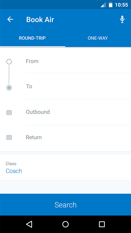
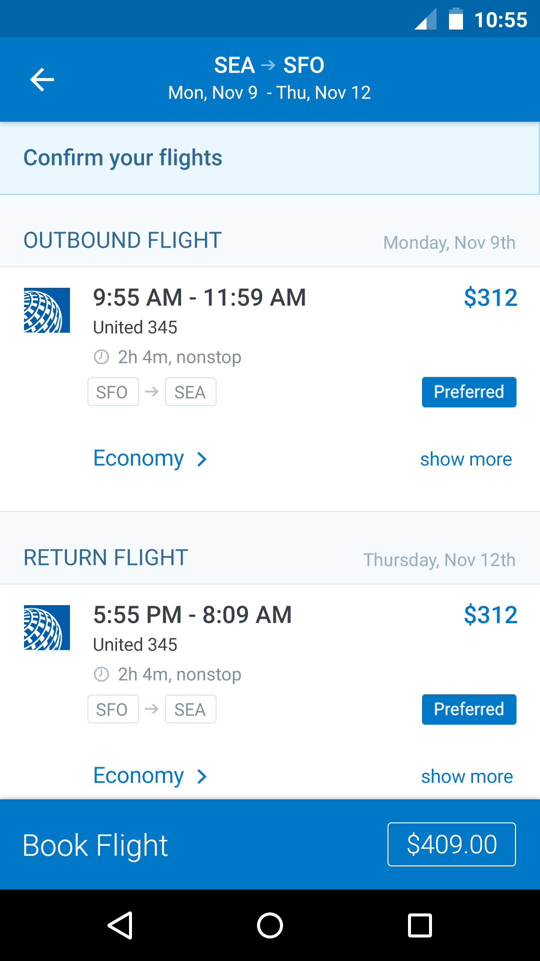
Buttons
A button consists of text and/or an image that clearly communicates what action will occur when the user touches it. The two main types of buttons used are Process buttons, and Ancillary buttons.
Buttons
Buttons
Single Action
Specs
Font, Color and Usage:
- Action background fill: Concur Blue (#0078C8)
- Buttons: 100% wide, 60 tall
- Title Alignment: centerX, centerY
- Title: Roboto Regular, 17sp, White (#FFFFFF)
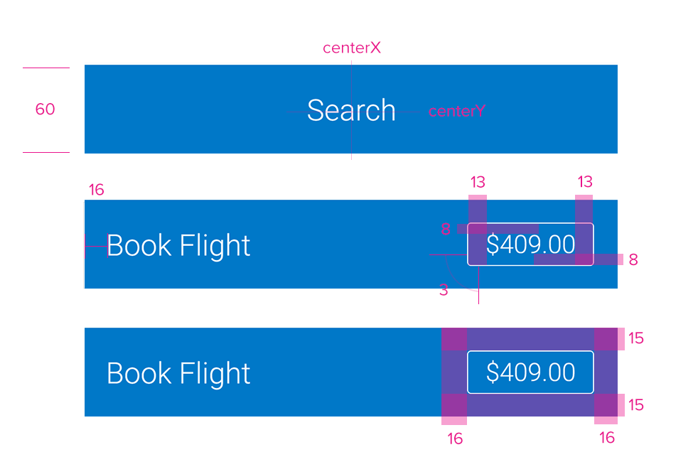
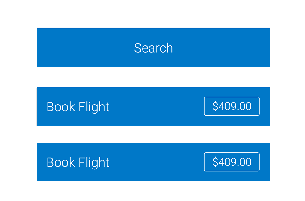
Single Action with Price
Specs
Font, Color and Usage:
- Action background fill: Concur Blue (#0078C8)
- Optional background fill: Orange (#EF812D)
- Buttons: 100% wide, 60 tall
- Title: 16 Right, centerY
- Title: Roboto Regular, 17sp, White (#FFFFFF)
- Price background stroke: 1pt, White (#FFFFFF)
- Price background padding: 8 Top & Bottom, 13 Left & Right
- Price background margin: 15 Top & Bottom, 16 Left & Right
- Price: Roboto Regular, 17sp, White (#FFFFFF)
Usage
The Action Button is used mainly when the action taken is the final step in a process (i.e. submitting an expense or booking a hotel). However, the Action Button may also be used for ancillary actions such as the Next button navigating to a new screen in the Walkthrough steps.
When an action button is tapped if there are required fields that have not been filled out, a toast should be shown indicating that there are required fields be filled out, and the screen will scroll to the fields in question. If there are mulitiple required fields yet to be filled out, scroll to the topmost one.
Redlines with Buttons