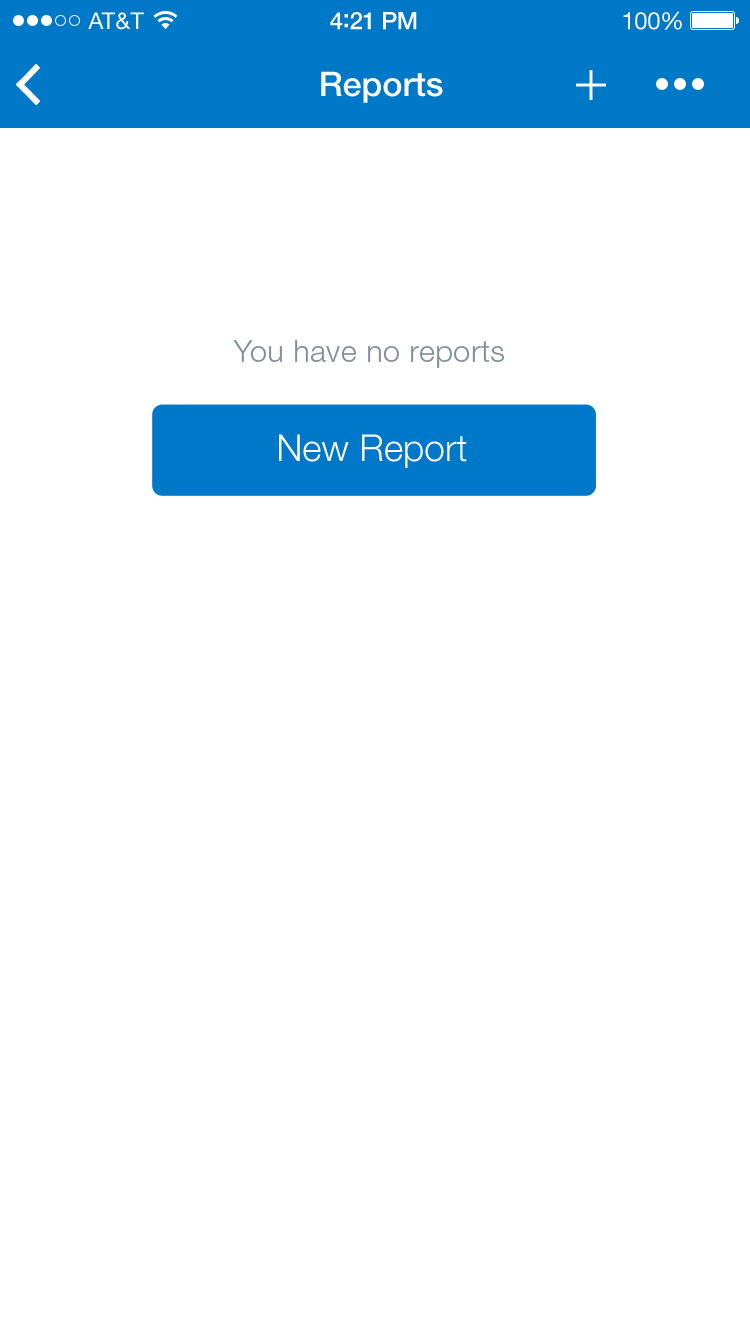
Navigation Bar
A Navigation Bar enables navigation through an information hierarchy and, optionally, management of screen contents. The Navigation Bar consists of the page title (when applicable) and navigation buttons and icons such as “close”, “back”, or an “overflow” icon. If the title is too long, it will be truncated with an ellipsis. When there’s a back arrow (pointing to the left) present, along with it is some text indicating where the button will take you. However if the page title is too long, the back context text is removed and just the arrow is shown.
Icon Navigation Bar
Text Navigation Bar
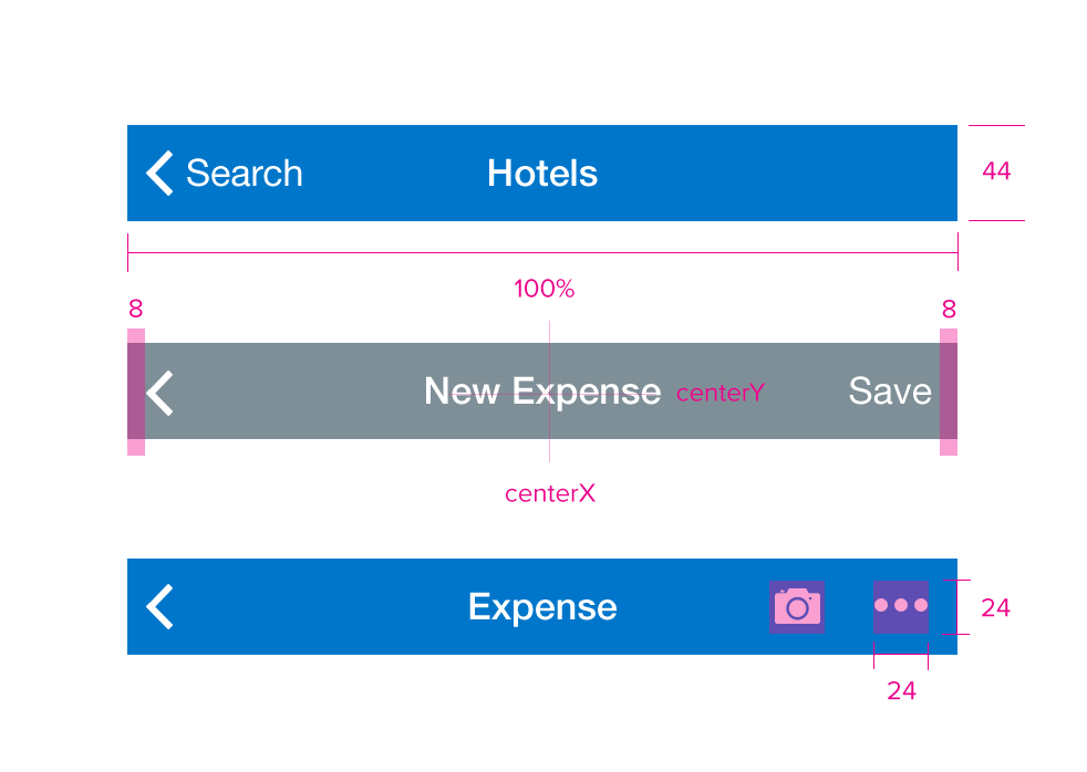
Specs
Font, Color and Usage:
- Default background fill: Concur Blue (#0078C8)
- “Unsaved” background fill: Dark Gray (#7F8F97)
- “Walkthrough” background fill: White (#FFFFFF)
- Navigation Bar: 44 tall
- Navigation Bar: 100% dynamic width
- Text: 8 padding
- Title: SF UI Text, 16 points, White (#FFFFFF)
- Iconography: 24, White (#FFFFFF)
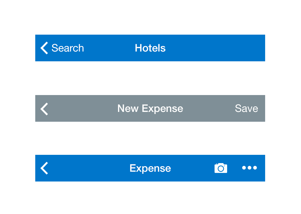
Redlines with Navigation Bar