Date Picker
The date picker uses the familiar calendar pattern. If a single date is required, a user may tap on the date to fill in the date form. If a date range is required, a user may tap on the start date and then the end date, or tap the start date and drag to the end date.
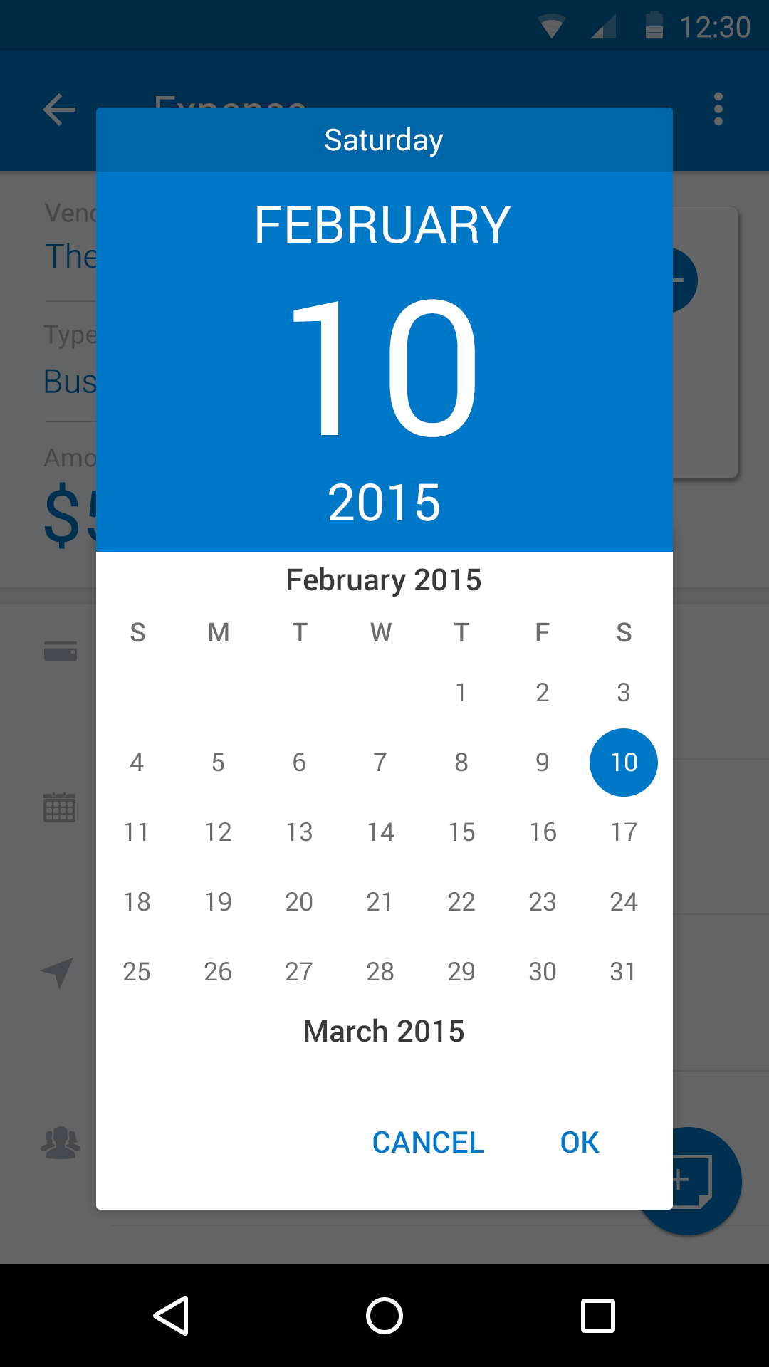
‘Single’ Date Picker

‘Multi’ Date Picker
‘Single’ Date Picker
Specs
Font, Color and Usage:
- Default background fill: Concur Blue (#0078C8)
- Default background: 208 tall, 270 wide
- ‘Saturday’ background fill: Navy Blue (#0066AA)
- ‘Saturday’ background: 30 tall, 270 wide
- Above ‘Saturday’ padding: 6 tall
- ‘Saturday’ Text: Roboto, 14 points, White (#FFFFFF)
- ‘Current Date’ background fill: Navy Blue (#0066AA)
- ‘Current Date’ background: 178 tall, 270 wide
- Above ‘February’ padding: 16 tall
- ‘February’ Text: Roboto, 24 points, White (#FFFFFF)
- Above ‘10’ padding: 26 tall
- ‘10’ Text: Roboto, 88 points, White (#FFFFFF)
- Above ‘2015’ padding: 22 tall
- ‘2015’ Text: Roboto, 24 points, White (#FFFFFF)
- Alignment: centerX
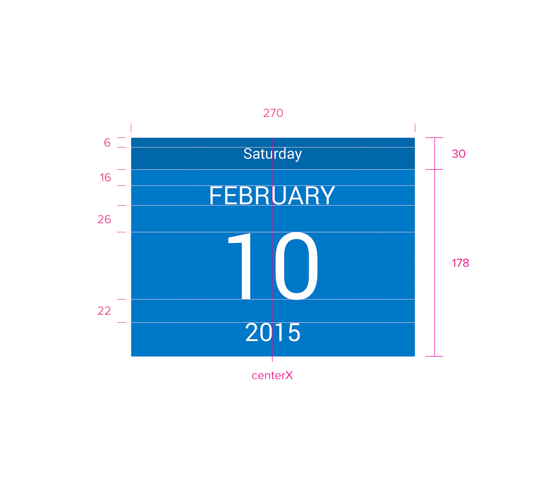
Redlines with ‘Single’ Date Picker
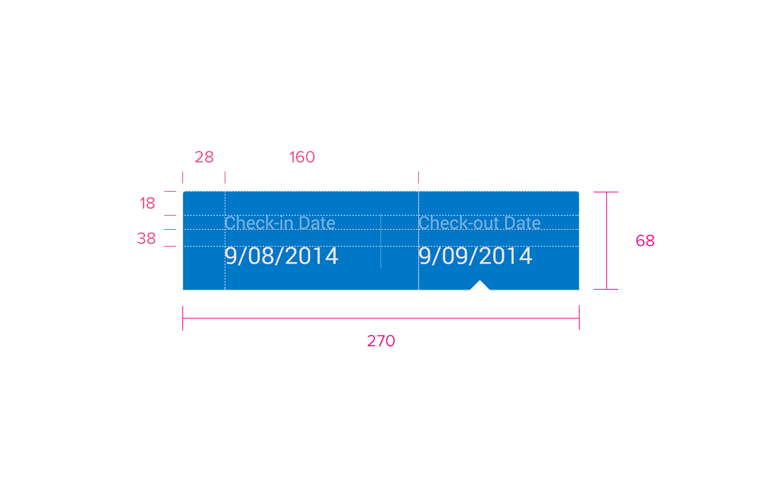
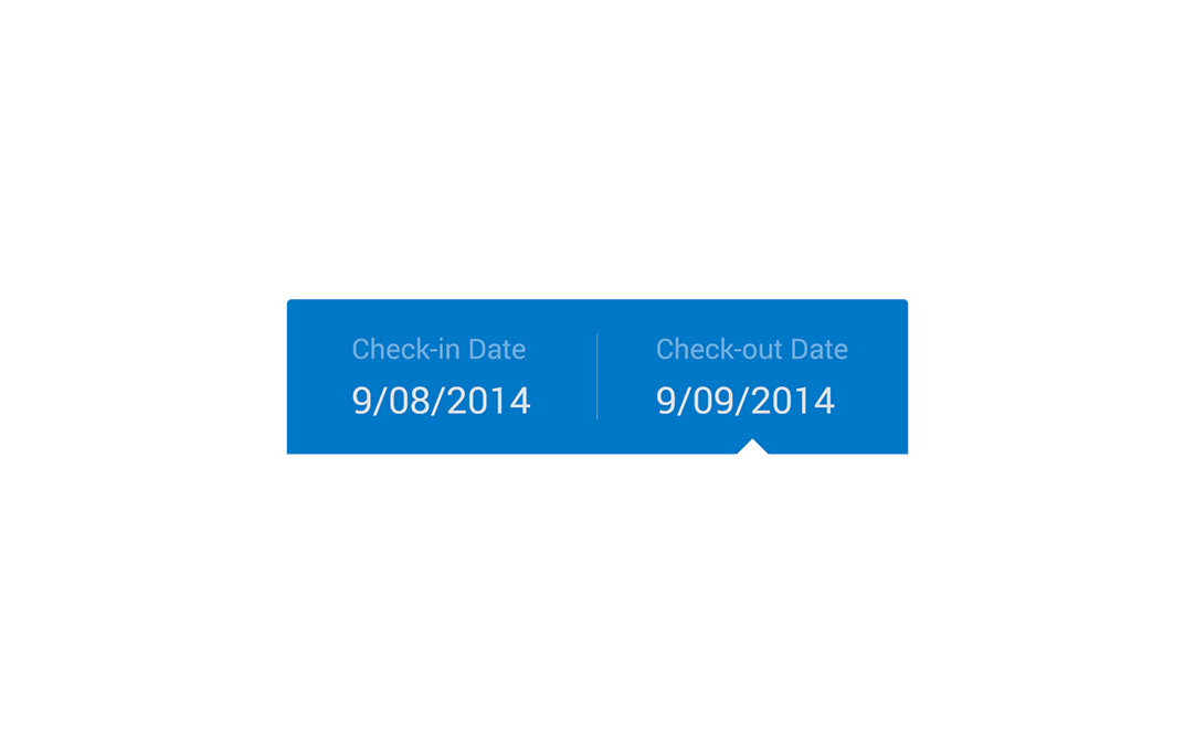
‘Multi’ Date Picker
Specs
Font, Color and Usage:
- Default background fill: Concur Blue (#0078C8)
- Default background: 68 tall, 270 wide - 100% dynamic wide
- ‘Check-in’ Text padding: 18 above, 28 right
- ‘Check-in’ Text: Roboto, 12 pt, White (#FFFFFF); 60% Opacity
- Padding above ‘09/08/2014’ Date : 38
- ‘Check-in’ Date: Roboto, 16 points, White (#FFFFFF)
- Divider Alignment: centerX, centerY
- Divider: 1px, White (#FFFFFF); 20% Opacity
- ‘Check-out’ Text: 160 right, 18 down
- ‘Check-out’ Text: Roboto, 12 points, White (#FFFFFF); 60% Opacity
- ‘Check-out’ Date: 38 down
- ‘Check-out’ Date: Roboto, 16 points, White (#FFFFFF)
- Arrow Pointer: centerX of the current selection
Redlines with ‘Multi’ Date Picker
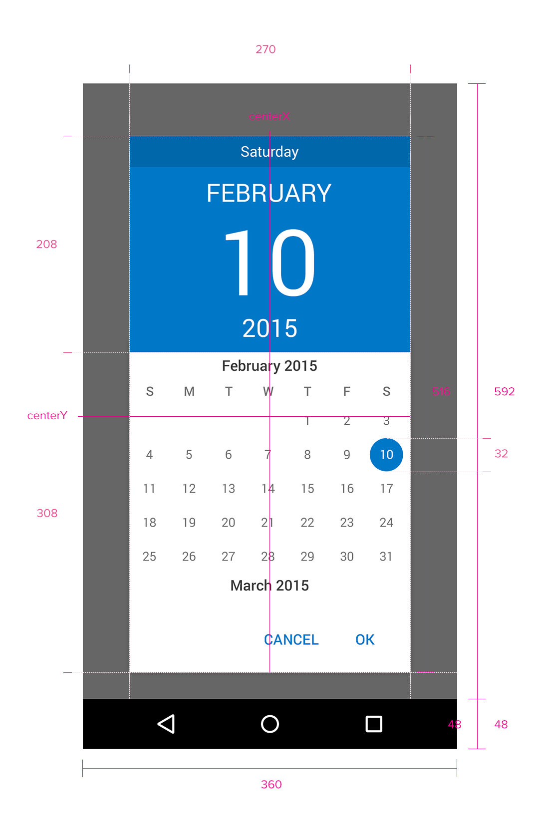
Calendar Picker
Specs
Font, Color and Usage:
- Modal Background fill: Black (#000000), 60% Opacity
- Modal background: 100% Dynamic tall, 100% Dynamic Wide
- Default background fill: White (#FFFFFF)
- Default background: 516 tall, 270 wide
- Default background Alignment: centerX, centerY
- Calender background: 308 tall, 270 wide
- Selector alignment: centerX, centerY
- Selector background fill: Concur Blue (#0078C8)
- Selector background: 32 tall, 32 Wide
- Selector text: Roboto, 12pt, White (#FFFFFF)
Redlines with Calendar Picker