Page Errors
There are multiple types of errors that can occur on a page. Errors also cover a broad range of things that can go wrong from small to large. This page provides an overview of the range of errors that can occur on a page, starting with specific field errors up to what happens when content, a page, or Concur can’t be loaded.
This page isn’t meant to provide guidance on alert levels (information, warning, or error) specific component behaviors, or UI copy. Image examples have been simplified to demonstrate an error and may not be an exact representation of a particular screen.
Field Validation
The most specific type of error occurs when a particular field doesn’t pass validation. This validation can occur immediately once focus is removed from a page element. Common uses are email, date, or numeric validation.
Immediate Validation Error
Other validation errors can occur after a Save button is selected or if a user re-enters a page that already contains errors. Typically these errors include a MessageBox (including the overlay) and once dismissed, a MessageBar at the top of the page which serves to provide a summary of errors as well as guide users to exact error locations.
A “validation on save” MessageBox can be seen below:
A “validation on save” MessageBar can be seen below:
Incomplete Information on a Page
Some warnings can be used to inform a user that fields on a page aren’t filled in or a task hasn’t been completed. This error can exist inside one or more tabs. If a warning or error exists in a tab, the first tab with an alert should be active.
In this example, the Card Program can be saved, but won’t be activated because a funding account is missing:
API or Content Loading Error
If the Page is Minimally Affected
It may be necessary to let the user know that some content on the page couldn’t be loaded. In this case, display a message at the top of the page and indicate the location of the missing content.
API Error:
If the Page is Rendered Useless or Unsafe
There are also cases where an entire page should be prevented from loading.
- Multiple APIs won’t load or multiple areas of a page can’t retrieve content and this essentially renders the page useless.
- The content that can’t load (in one or more sections) is important enough for decision making such that the page becomes unsafe to use. In other words, a user might take an unwanted action because they don’t have all the information they need.
Page with Two Critical Content Areas:
If critical sections can’t load, display an alert informing the user and don’t load the remainder of the page:
MessageBar: Closable or Not?
The MessageBar component contains an optional close “X” that allows users to dismiss the message.
In the event of a loading error, it’s best to omit the close “X” so the message of missing content stays visible. However, if dismissing the message benefits the user, this is also an option. Please work with your UX Designer to determine what’s the best use for your particular situation.
Entire Page
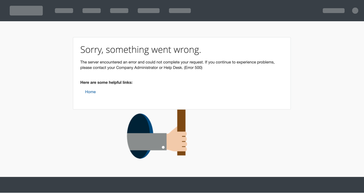
In the event of a server error (404, 500, etc.) the user will receive a Server Error page showing our shell (global navigation header and footer) and an error message. This error page is provided by Core UI.

Site Down
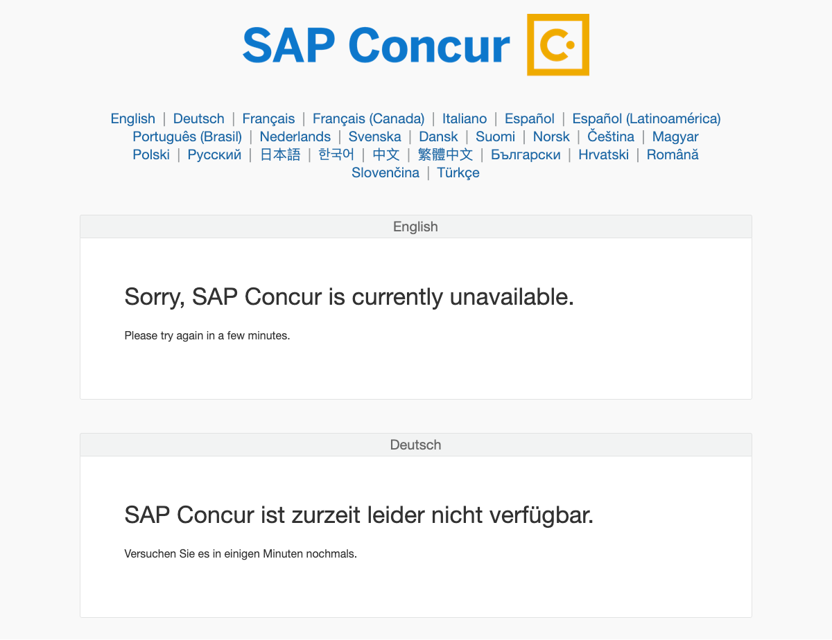
In the event that SAP Concur is down and cannot be reached at all, users are directed to the SAP Concur Site Down page. This page is provided by Core UI.


