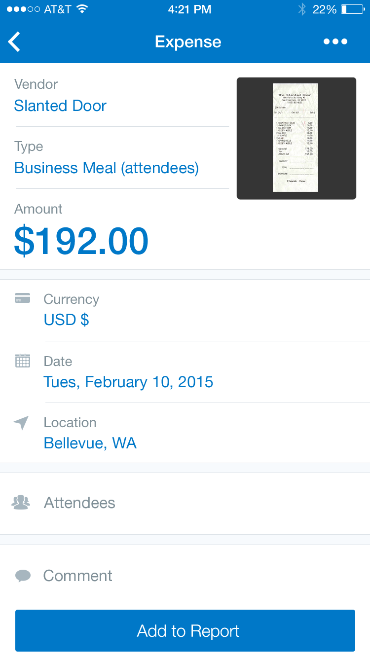
Text Fields
Touching a text field places the cursor in the field and automatically displays the keyboard. In addition to typing, text fields allow for a variety of other tasks, such as text selection (cut, copy, paste) and data lookup via auto-completion.
When a text field is empty, the label or title of the text field is displayed centered in the field. Once the field is selected, the label shrinks and moves up to allow space for the entered text. This is all done in-line, staying on the current screen.

Text Fields
Text Fields
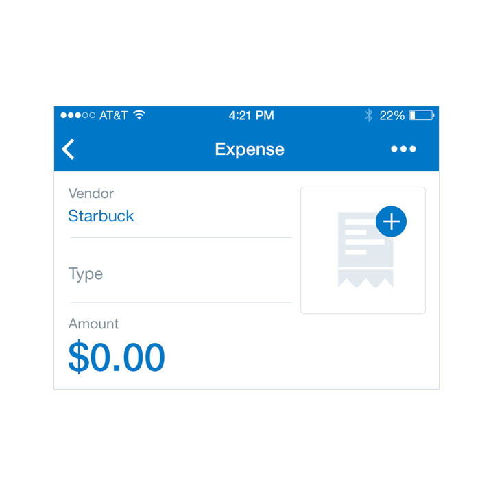
‘Normal’ Text Field
Specs
Font, Color and Usage:
- ‘Normal’ Text Field: 64 tall
- ‘Normal’ Title: 15 right, 26 down
- ‘Normal’ Title: SF UI Text, 16 points, Dark Gray (#7F8F97)
- Divider: 20 down
- Divider: 1pt, Light Gray (#DBE1E6)
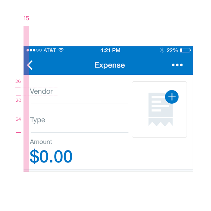
Redlines with ‘Normal’ Text Fields
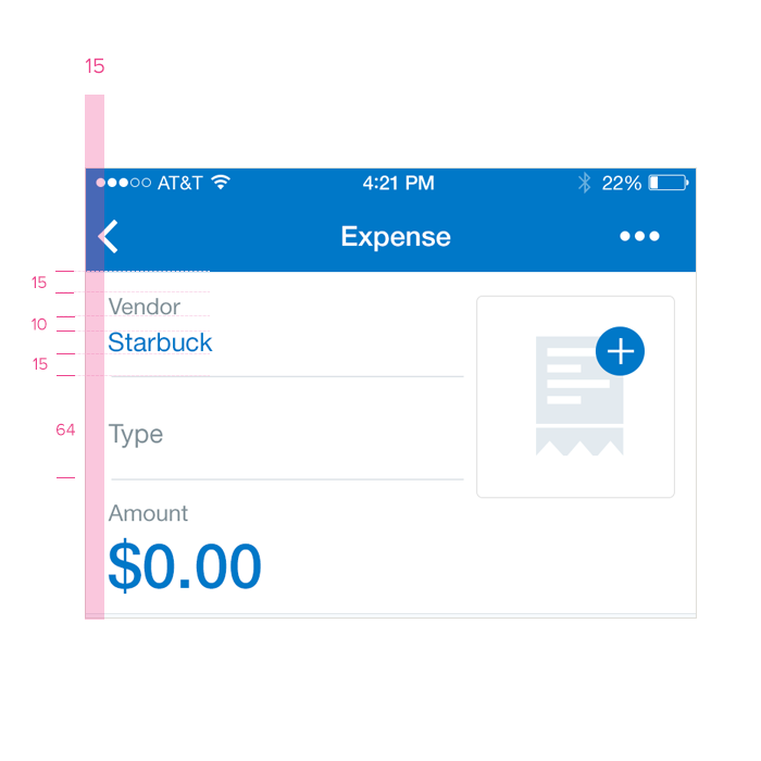
‘Focus’ Text Field
Specs
Font, Color and Usage:
- ‘Focus’ Text Field: 64 tall
- ‘Vendor’ Title: 15 right, 15 down
- ‘Vendor’ Title: SF UI Text, 14 points, Concur Blue (#0078C8)
- ‘Company’ Value: 15 right, 10 down
- ‘Company’ Value: SF UI Text, 16 points, Concur Blue (#0078C8)
- Divider: 15 down
- Divider: 1pt, Light Gray (#DBE1E6)
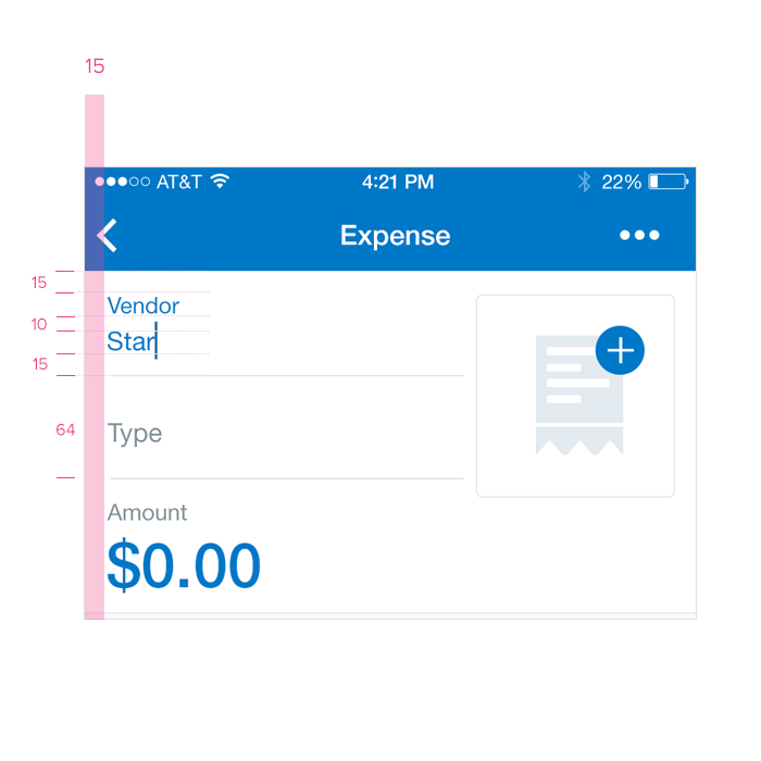
Redlines with ‘Focus’ Text Fields
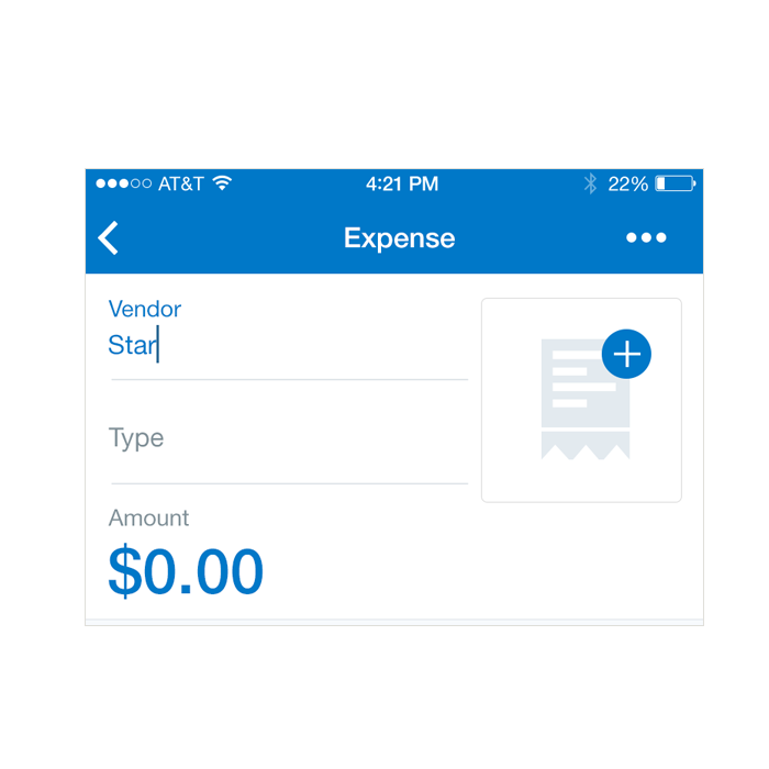
‘Active’ Text Field
Specs
Font, Color and Usage:
- ‘Active’ Text Field: 64 tall
- ‘Vendor’ Title: 15 right, 15 down
- ‘Vendor’ Title: SF UI Text, 14 points, Dark Gray (#0078C8)
- ‘Company’ Value: 15 right, 10 down
- ‘Company’ Value: SF UI Text, 16 points, Concur Blue (#0078C8)
- Divider: 15 down
- Divider: 1pt, Light Gray (#DBE1E6)
Redlines with ‘Active’ Text Fields
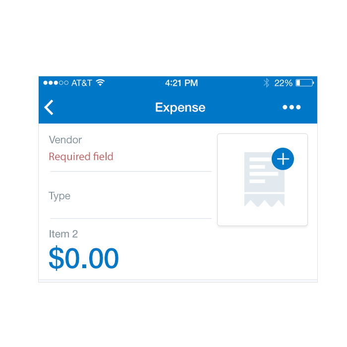
‘Error’ Text Field
Required fields are pre-filled in with “Field name is required” and is colored light Gray. When the user taps on the field, the field is automatically cleared so the user doesn’t have to clear it manually. If a form is submitted and a required field has not been filled, the user is presented with an overlay stating as much. In addition, required fields are indicated in red and the page is automatically scrolled to the first unfilled required field.
Specs
Font, Color and Usage:
- ‘Active’ Title: SF UI Text, 14 points, Dark Gray (#0078C8)
- ‘Active’ Value: SF UI Text, 16 points, Red (#BF6767)
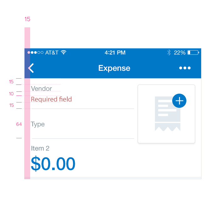
Redlines with ‘Error’ Text Fields