Tags
Tags are used to highlight an item and set it apart from the rest of the content. They may contain either text or an icon. Also, they may display as an outline or a filled-in rectangle.
Tags
Tags
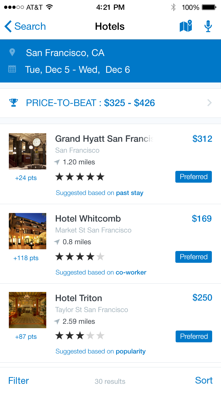
‘Preferred’ Tags
Specs
Font, Color and Usage:
- ‘Preferred’ background fill: Concur Blue (#0078C8)
- ‘Preferred’ background: 62 wide, 20 tall
- Title padding: 5 top & bottom, 8 left & right
- Title: SF UI Text, 12 points, White (#FFFFFF)
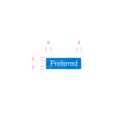
Redlines with ‘Preferred’ Tags
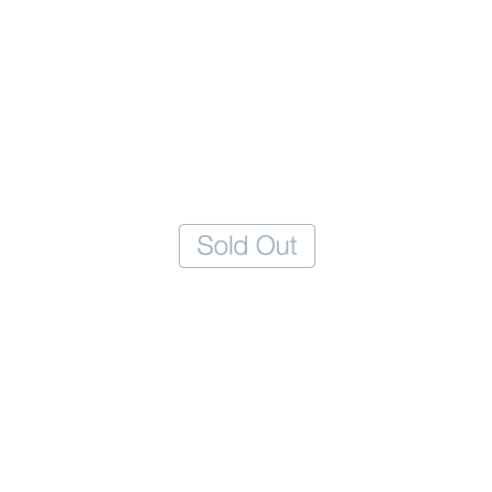
‘Sold Out’ Tags
Specs
Font, Color and Usage:
- ‘Sold Out’ background fill: White (#FFFFFF)
- ‘Sold Out’ stroke: 1pt, Medium Gray (#A7B6BF)
- ‘Sold Out’ background: 62 wide, 20 tall
- Title padding: 5 top & bottom, 8 left & right
- Title: SF UI Text, 12 points, Medium Gray (#A7B6BF)
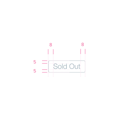
Redlines with ‘Sold Out’ Tags
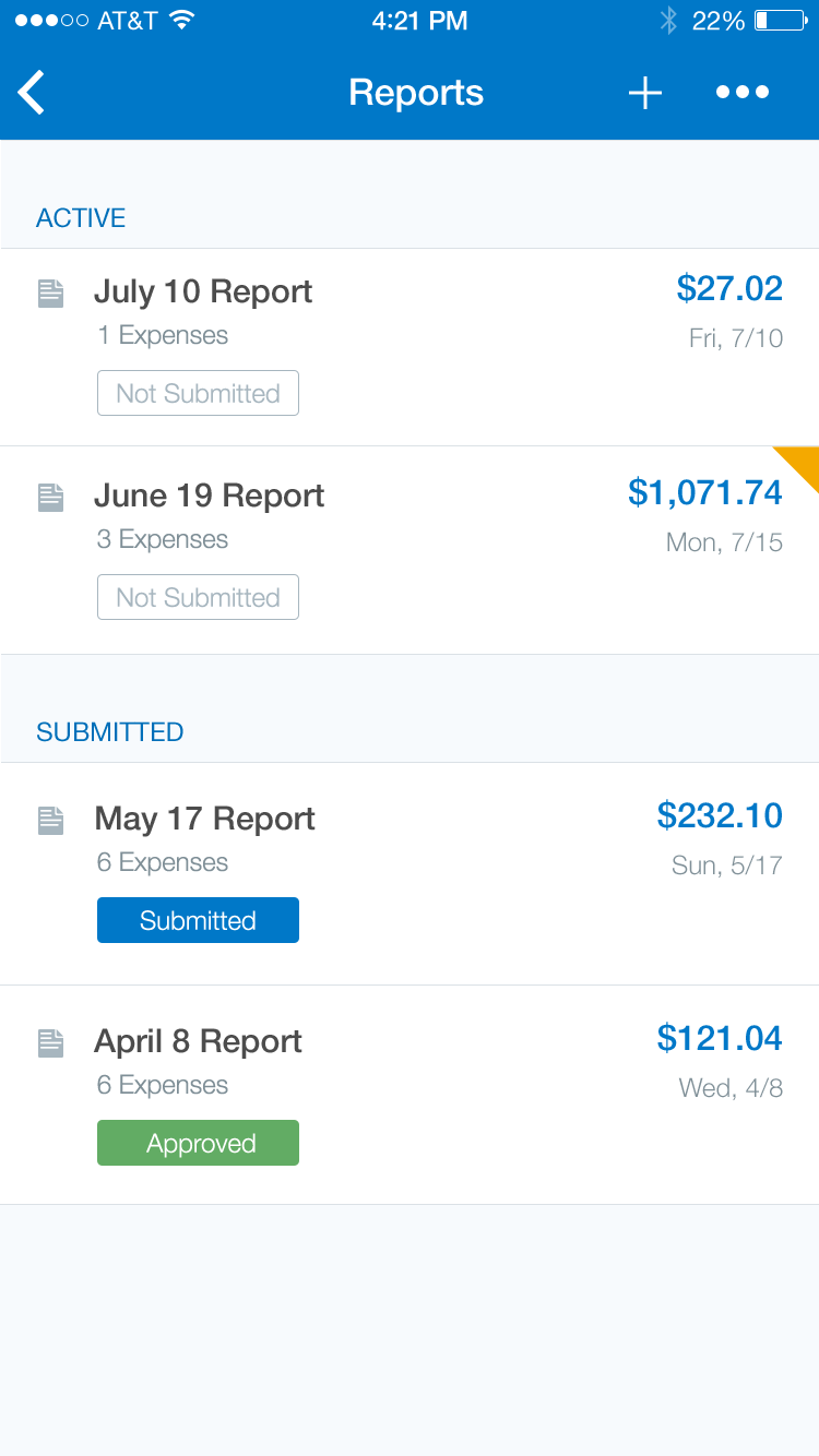
‘Approved’ Tags
Specs
Font, Color and Usage:
- ‘Approved’ background fill: Green (#62AC64)
- ‘Approved’ background: 62 wide, 20 tall
- Title padding: 5 top & bottom, 8 left & right
- Title: SF UI Text, 12 points, White (#FFFFFF)
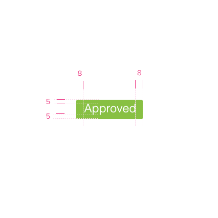

Redlines with ‘Approved’ Tags