Toggle
When multiple selections are required in a list view, the user first taps the “select” icon and the view is put in “select mode”. Now the user may select one or more items by tapping on them and using the contextual actions that appear on the bottom of the screen to act on the checked items.
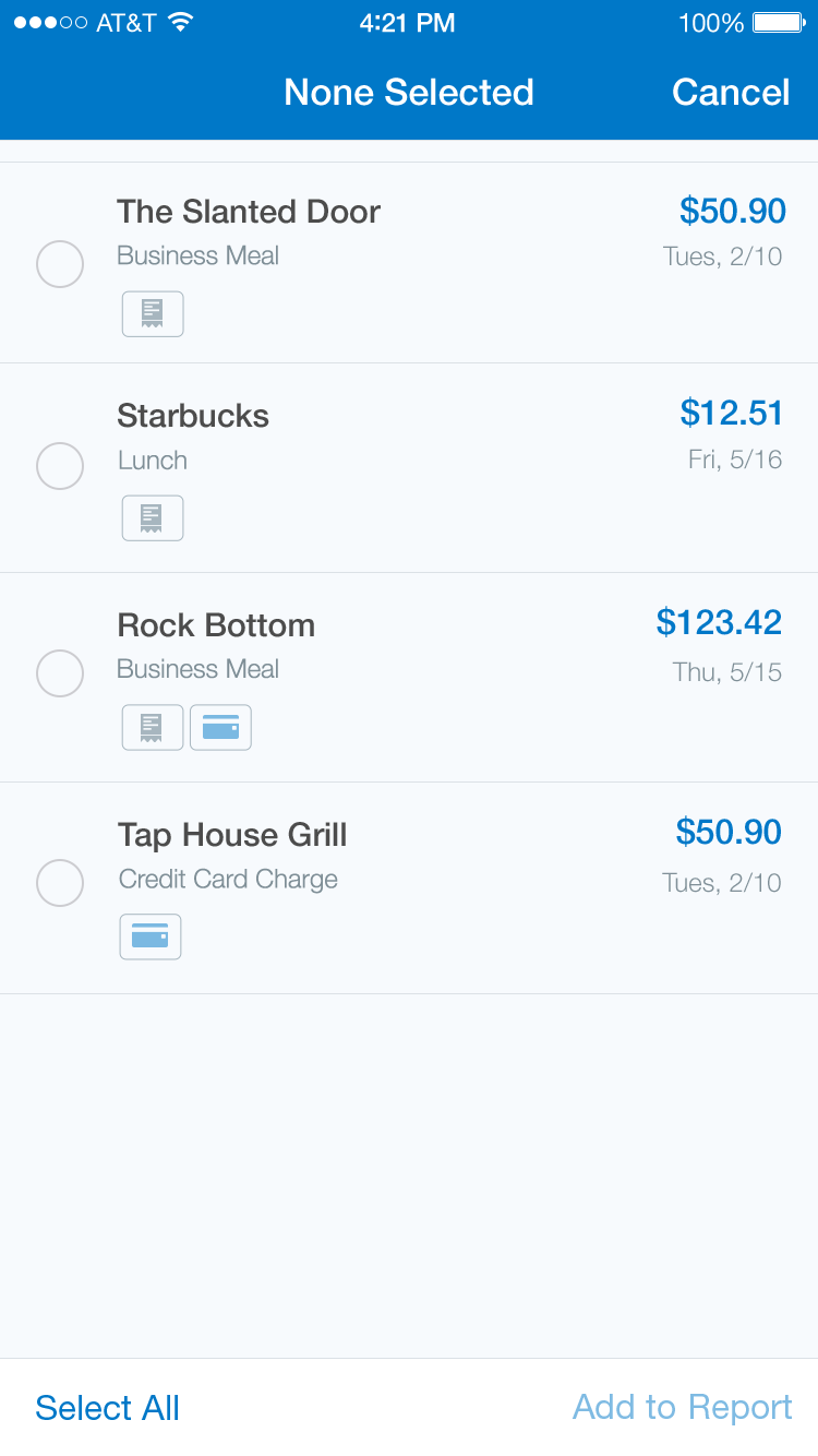
Toggle - None Checked
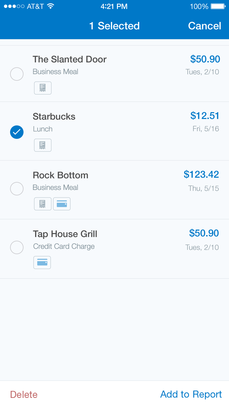
Toggle - One Checked
Specs
Font, Color and Usage:
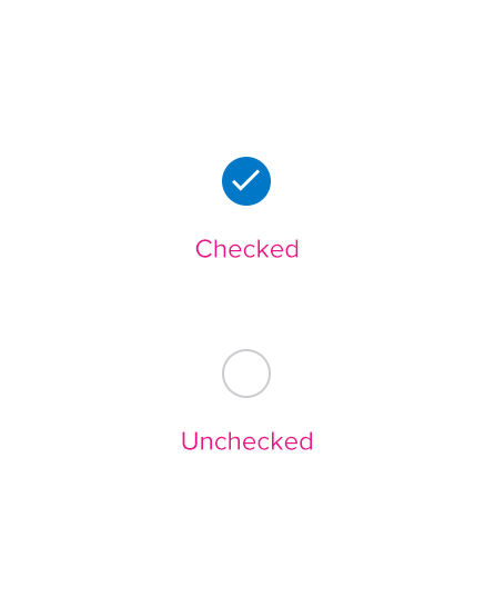
- ‘Checked’ background fill: Concur Blue (#0078C8)
- ‘Unchecked’ stroke: Medium Gray (#A7B6BF)
Redlines with Toggle