Date Picker
The date picker uses the familiar calendar pattern. If a single date is required, a user may tap on the date to fill in the date form. If a date range is required, a user may tap on the start date and then the end date, or tap the start date and drag to the end date.
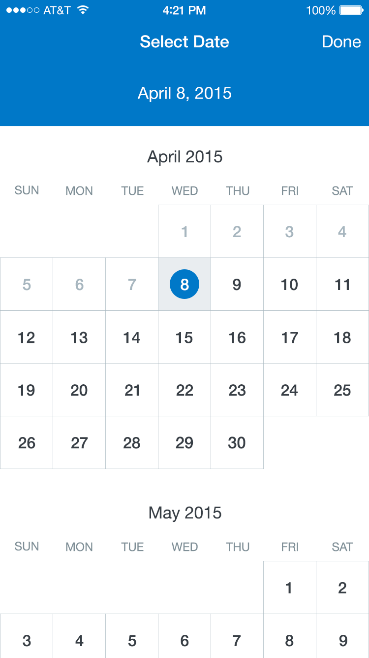
Single Date Picker
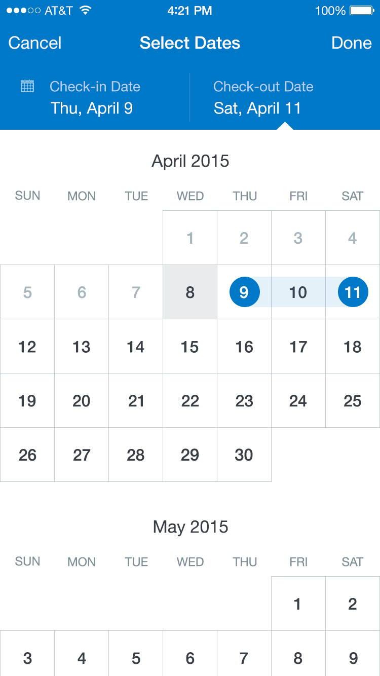
Multi Date Picker
Single Date Picker
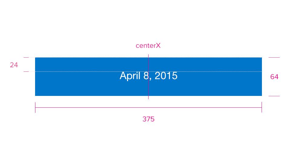
Specs
Font, Color and Usage:
- Default background fill: Concur Blue (#0078C8)
- Default background: 64 tall, 375 wide - 100% dynamic wide
- Date Alignment: centerX, 24 down
- Date: SF UI Display, 20 points, White (#FFFFFF)
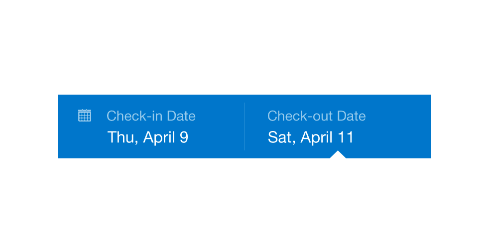
Redlines with Single Date Picker
Multi Date Picker
Specs
Font, Color and Usage:
- Default background fill: Concur Blue (#0078C8)
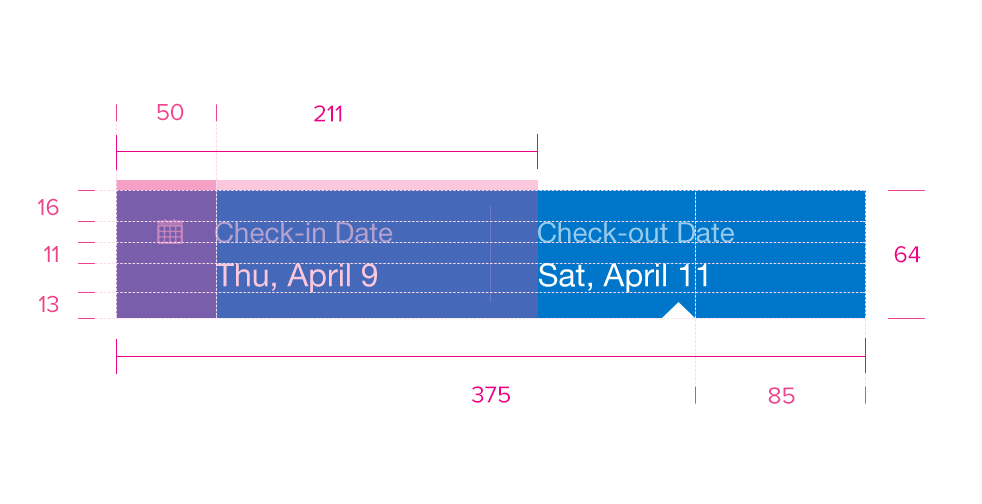
- Default background: 64 tall, 375 wide - 100% dynamic wide
- ‘Check-in’ Text: 50 right, 16 down
- ‘Check-in’ Text: SF UI Display, 14 points, White (#FFFFFF); 60% Opacity
- ‘Check-in’ Date: 11 down
- ‘Check-in’ Date: SF UI Display, 16 points, White (#FFFFFF)
- Divider Alignment: centerX, centerY
- Divider: 1px, White (#FFFFFF); 20% Opacity
- ‘Check-out’ Text: 211 right, 16 down
- ‘Check-out’ Text: SF UI Display, 14 points, White (#FFFFFF); 60% Opacity
- ‘Check-out’ Date: 11 down
- ‘Check-out’ Date: SF UI Display, 16 points, White (#FFFFFF)
- Arrow Pointer: Indented 85 based off of current selection
Redlines with Multi Date Picker
Calendar Picker
Specs
Font, Color and Usage:
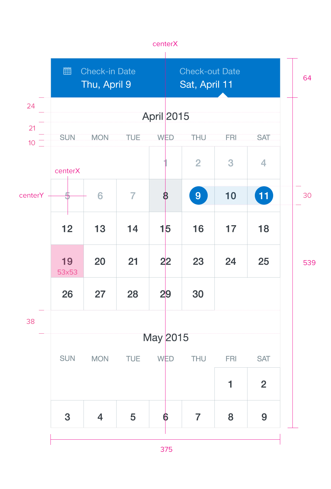
- Default background fill: White (#FFFFFF)
- Default background: 539 tall, 100% dynamic wide
- Padding above Month: 24
- Month Text: SF UI Display, 17 points, Charcoal (#383F46)
- Padding above Days of the Week: 21
- Days of the week Text: SF UI Display, 12 points, Dark Gray (#7F8F97)
- Padding above Dates: 10
- Date background fill: Light Gray (#DBE1E6)
- Date background: 53 tall, 53 wide
- Date Dividers: 1px, Medium Gray (#A7B6BF); 70% Opacity
- Date Text Alignment: centerX, centerY
- Date (Past) Text: SF UI Display, 16 points, Medium Gray (#A7B6BF)
- Date (Current) background fill: Light Gray (#DBE1E6)
- Date (Current) Text: SF UI Display, 16 points, Charcoal (#383F46)
- Date (Future) Text: SF UI Display, 16 points, Charcoal (#383F46)
- Selector Alignment: centerX, centerY
- Selector background fill: Concur Blue (#0078C8)
- Selector background: 30 tall, 30 wide
- Selector Highlight background fill: Concur Blue (#0078C8); 10% Opacity
- Selector Highlight background fill: 100% dynamic wide
- ‘Check-in’ Text: SF UI Display, 16 points, White (#FFFFFF)
- ‘Check-out’ Text: SF UI Display, 16 points, White (#FFFFFF)
- Padding below Month: 19
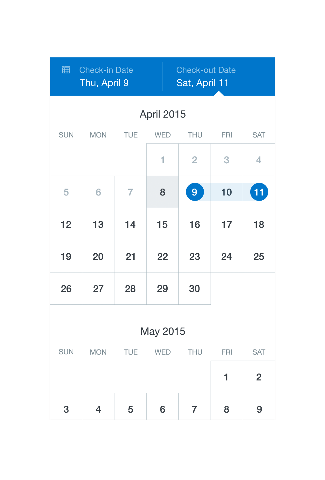
Redlines with Calendar Picker