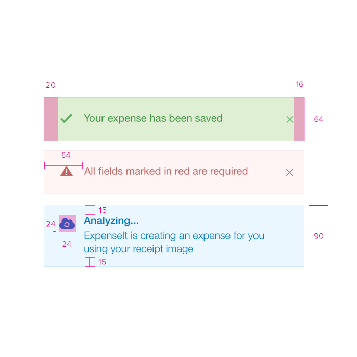
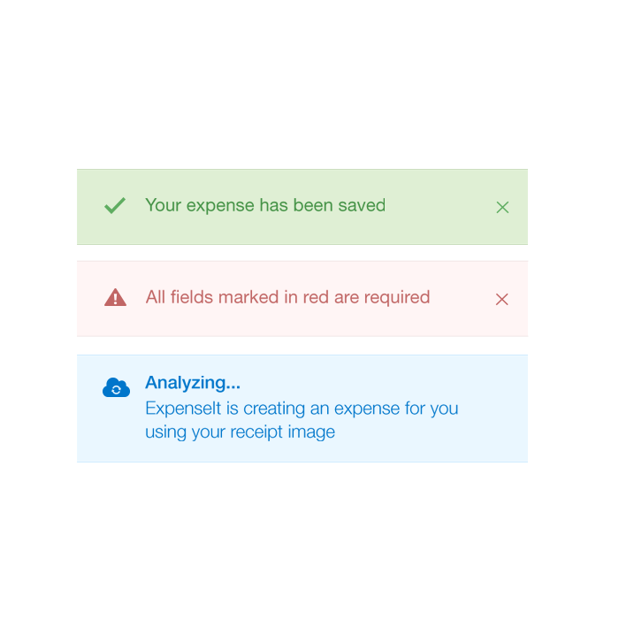
Notifications
Notifications give the user immediate actionable information relevant to a task or an error.
Notifications
Notifications
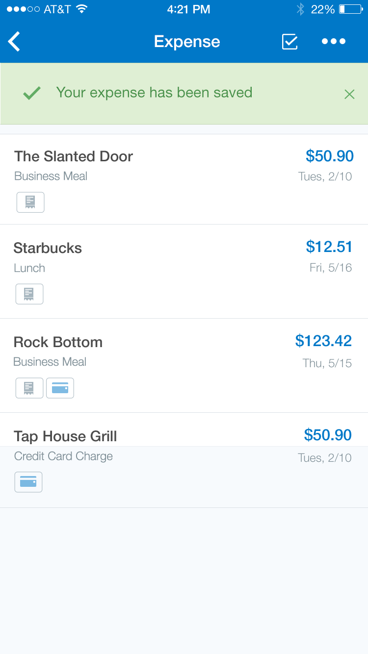
Success
Specs
Font, Color and Usage:
- ‘Success’ background fill: Light Green (#DFEFD4)
- ‘Success’ background: 100% wide, 64 tall
- ‘Success’ background padding: 20 left, 15 top, 16 right
- ‘Approval’ Icon: 24x24
- Title padding: 64 right
- Title: SF UI Text, 16 points, Green (#62AC64)
- Close Icon: Green (#62AC64)
- Alignment: centerY
Required
Specs
Font, Color and Usage:
- ‘Required’ background fill: Light Red (#FFF5F5)
- ‘Required’ background: 100% wide, 64 tall
- ‘Required’ background padding: 20 left, 15 top, 16 right
- ‘Warning’ Icon: 24x24
- Title padding: 64 right
- Title: SF UI Text, 16 points, Red (#BF6767)
- Close Icon: Red (#BF6767)
- Alignment: centerY
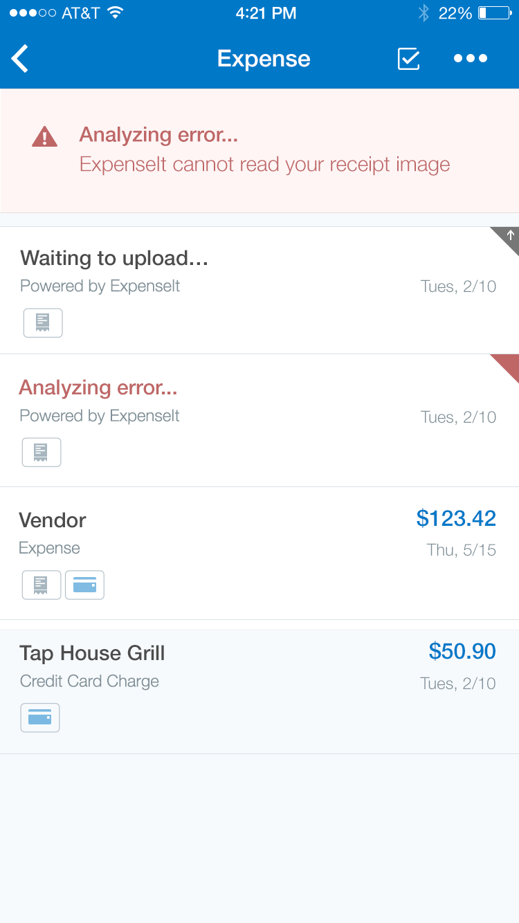
Analyzing
Specs
Font, Color and Usage:
- ‘Analyzing’ background fill: Light Blue (#EAF7FF)
- ‘Analyzing’ background: 100% wide, 90 tall
- ‘Analyzing’ background padding: 20 left, 15 top, 16 right, 15 bottom
- ‘Analyzing’ Icon: 24x24
- Title padding: 64 right
- Title: SF UI Text, 16 points, Blue (#00A9F2)
Redlines with Notifications
‘Required’ Example
The following demonstrates how an error status flag in the corner of a cell will lead the user down a path to the source of the error.
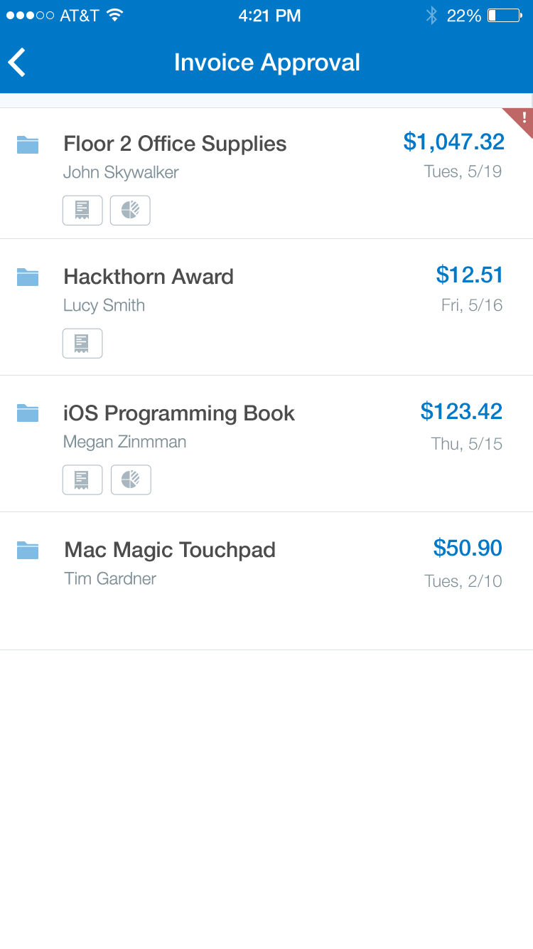
1 - An error status flag is shown on the “Floor 2 Office Supplies” cell.
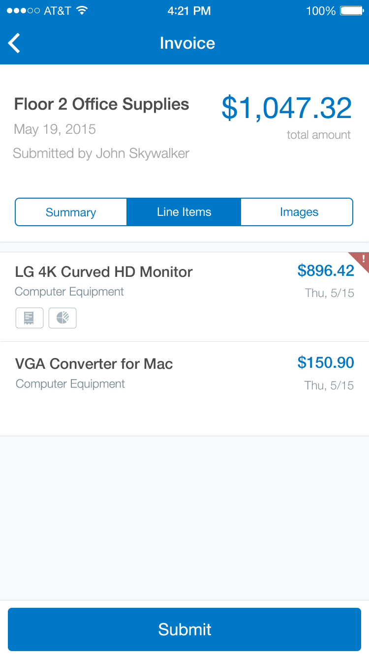
2 - The user taps each cell that displays the status flag.
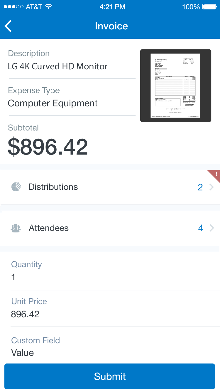
3 - Narrowing in on the final cell that requires attention.
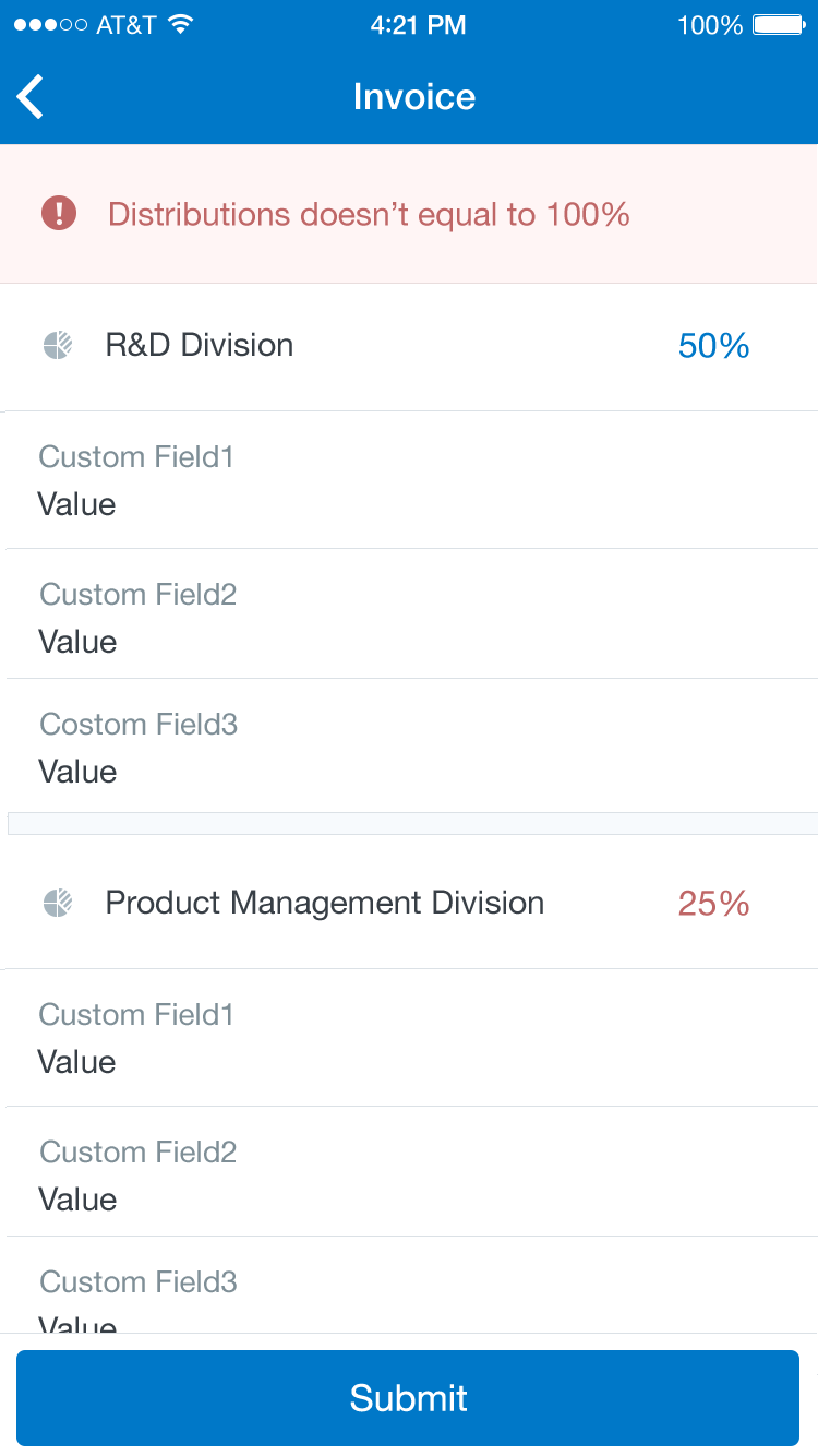
4 - The error is described in greater detail at the top of the list. Midway down the error is highlighted in red.